Bathymetric Maps, otherwise known as seafloor mapping, is the representation of sub-water features. This map of Lake Tahoe shows the depth through a color shaded relief. The green shading is areas of rapid decline. Lake Tahoe has a uniform bottom layer consisting of few elevated features. These maps are taken with LIDAR and other remote sensing technologies that penetrate the water and provide accurate elevation recordings.
Map Catalog
Friday, August 1, 2014
Isotherm Map of the U.S.
Isotherm maps represent temperature differences across a given area. In this example, the surface temperature is graphed across North America. The graph indicates very high temperates in the southeast, southwest and middle U.S. The temperatures start to drop near the northern Rocky Mountains and into Canada. Theses measurements were taken in June and help explain the extent of high temperatures. The contour lines represent areas of equal surface temperature.
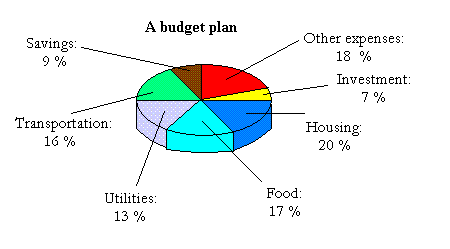
Circle Graph of Budget Plan
Circle Graphs or pie-charts are efficient methods of graphing proportionally. In this graph, a current budget plan is graphed to designate different expenses in hopes of managing money more effectively. All circle graphs will summate to 100% and can be used to show simple relationships such as political party or area land use.
Bivariate Choropleth Map
Bivariate Choropleth Maps analyze two separate variable using different visual markers. This technique is used to compare two variable to see if a relationship exists. This map of the U.S. shows the capacity for ethanal facilities and crop acreage. The areas where crop acreage is highest correspond to the greatest capacity for ethanol production.
Unclassed Choropleth Map of Life Expectancy
Unclassed choropleth maps are smilier to classed choropleth maps but lack an averaged intervals. These maps are useful in showing the differences of a tested variable over a given area. This maps depicts the life expectancy in Africa over percentile color shaded scale.
Continuously Variable Proportional Circle Map of Canadian Territories
Continuously Variable Proportional Circle Maps show the frequency of a variable in non-proportianl intervals. This map of Canada show the amount of territories and provinces through the circles. The intervals are arbitrarily chosen to select convenient breaks in the data. These maps are useful in comparing randomly arranged variables.
Population Profile of Australian Indignity
Population Profiles are proportional graphs showing the percentage of a particular interval as compared to the entire population. In this population profile, non-indigenous population are plotted against indigenous ones. A trend exists between both female and male populations. The percentage of indigenous inhabitants is far greater at younger ages then non-indigenous. This indicates that most immigrants decide to move at mid level ages (20-54). Population profile graphs are useful in visualizing the proportions of population based on age or another variable such as income.
Subscribe to:
Comments (Atom)


